With the 2012 Olympic Games rapidly approaching, I keep seeing that monstrosity of a logo all over the place. Olympic Games are notorious for having badly designed logos, or at least boring uninspiring logos. I decided to take a look at the history of Olympic logos, and share my 3 favorite as well as my 3 most hated (aside from this year's logo).
Starting with my 3 least favorite (again, aside from this year's design):
The '72 Munich logo is certainly a love/hate for me, as I personally love the design and aesthetic of the piece. However, I am a firm believer that Olympic logos should contain the Olympic rings (I believe they are required to now-a-days) Although this is a great eye-catching design, when viewed out of context, I would really have no idea what it was for. Its a shame to see a great design be so un-useful.
My second selection is the '72 Sapporo Winter Games logo. None of the elements individually irk me, but I think the obvious question is where are they going with this? Is it just me, or is this 3 separate logos glued together. Additionally, that stroke rubbing the Olympic rings and the type is just all too touchy-feely for my likes.
Finally we've got the '94 Lillehammer Games. Not much to be said outside of mentioning that it certainly looks like a logo that would pop up prior to a movie I am watching.. and I don't think Lillehammer is in the film production biz. Again, not terrible work.. but it doesnt make any sense to me.
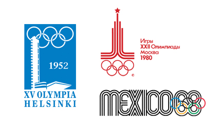
Picking my 3 favorite was a bit easier. Certainly a smaller selection to choose from, and these 3 were the big winners:
The '52 Helsinki Summer Games is a wonderful logo that manages to stay simple and capture the uniqueness of the city at the same time. My only concern is that the color makes it feel very "winter" to me... or maybe it is the fact that I never considered Finland a particularly "summer" country. Feeling cold or not, the simplicity is enjoyable - and I bet it would look great on a stamp.
Next, I chose the '80 Moscow Games. I simply love the Cold War era design. I find the logo a bit humorous, as can't help but think that the star at the top represents the Soviet Union as a super-power... rather than representing the spirit of the game and a podium. Regardless of intent, this is one of the few Olympic logos I've seen that actually reminds me of competition and sport.
Last but not least is the '68 Mexico logo. It is hard not to include a design that has prompted so many positive reviews in the design community. I can't say I love it as much as most, but it really is about as close to actual design that anyone has come regarding Olympic logos. Eye-catching and original to say the least.


